9 Presentation Design Mistakes That Undermine Good Research (And How to Fix Them)
Every semester, I sit through a fresh batch of student presentations, and every semester the same pattern repeats: strong research, undermined by a slide deck fighting against it. The data is often solid. The slides rarely help it land.
This isn't really about design taste. In a research setting, a slide is a communication instrument; its job is to present one clear idea into your audience's head before you move to the next one. Most "bad" slides fail not because they're ugly, but because they're doing too many jobs at once: reading material, speaker notes, and visual aid, all crammed into one rectangle.
Here's the breakdown I actually use.
1. Start With an Outline, and Actually Follow It
Your first or second slide should be a map of the talk: 4–6 main points, nothing more. The value isn't the outline slide itself, it's the discipline it forces afterward.
Keep it to titles-as-main-points; save the explaining for when you get there.

2. Structure: One Idea, Few Words, One Point at a Time
The single biggest failure mode in academic slides is treating them like a manuscript. A paragraph of full sentences on screen forces your audience to choose between reading and listening, and reading usually wins, which means they've stopped listening to you.
The fix is unglamorous but effective:
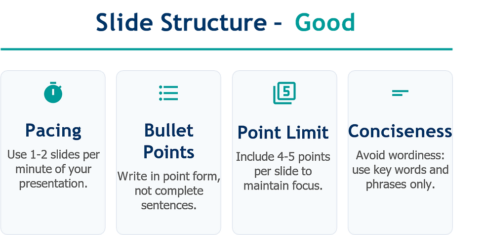
Point form, not prose. Key words and phrases, not complete sentences.
4–5 points per slide, max. More than that and nothing gets emphasis.
1–2 slides per minute of talk time. If you're blowing past that, you're narrating a document, not giving a talk.
Reveal one point at a time where the software allows it. It keeps the audience's attention synced to your voice instead of three bullets ahead of you.

Animation deserves one caution here. It's a tool for pacing attention, not decoration. Distracting transitions, or a different animation style on every slide, cost you more focus than they earn.
3. Fonts: Legibility Beats Personality

Nobody has ever been persuaded by a font. But plenty of good arguments have been undercut by one that's too small to read from the back row.
Use a minimum of 18pt and establish a clear hierarchy: for example, 36pt for titles, 28pt for main points, and 24pt for secondary text, so the eye is guided appropriately.
Choose standard, highly readable fonts like Arial, Tahoma, or similar. Reserve unique typography for your blog, not your presentation.
Avoid using all-caps text blocks. They come across as shouting and are significantly harder to read than mixed case text.

4. Color: A Tool for Emphasis, Not Decoration
Color should serve a single purpose: to guide attention or enhance structure, such as a light-blue title above dark-blue body text, or a single highlighted word in an otherwise neutral slide. When color is used merely "to make it look nice," it begins to compete with your data for attention..
Two rules cover most of it:
Contrast first. Dark text on light background (or the reverse). Never use a color that blends into its background.
Fewer colors, used consistently. A different color per bullet point isn't organization, it's noise.


If you want to check contrast objectively rather than by eye, these are worth bookmarking:
5. Backgrounds: Simple, Light, and Consistent
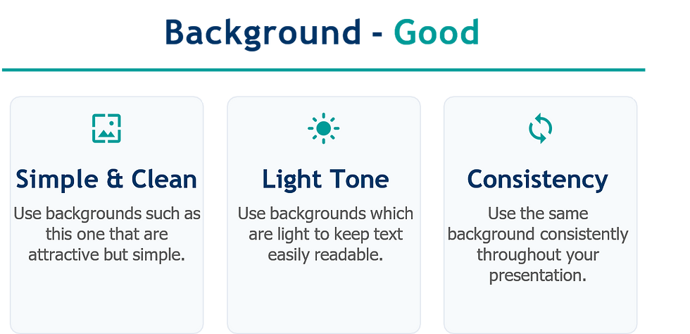
The sole purpose of a background is to remain unnoticed. Templates that are too busy, heavy images behind text, or backgrounds that vary from slide to slide distract from the main content. The entire guideline is to keep it light, simple, and consistent throughout the entire presentation.
6. Graphs: Show the Trend, Don't Make Them Compute It
This is the one I would emphasize most for a research audience, as it's often where valuable data gets overlooked. A complex table requires your audience to perform mental calculations on the spot : identifying trends, comparing magnitudes, and remembering them later. A well-crafted graph accomplishes this task for them.
What separates a graph that works from one that doesn't:
A clear, descriptive title. Not "Figure 3", something that states the takeaway.
Clean visual style. No 3D effects, no heavy gridlines, no gradient fills that obscure the actual values.
Purposeful color. Neon palettes with no functional meaning just add cognitive load.
Legible spacing. If someone has to lean in to read your axis labels, the slide has already lost them.


For picking a palette that's both legible and not garish, I keep these three in rotation:
7. Spelling and Grammar: The Credibility Tax
This might seem too simple to mention, but a typo in a research presentation can cause significant harm, it prompts the audience to question what else might have been overlooked.
Carefully proofread for repeated words and grammatical errors, and if you're presenting in a language that isn't your native one, ask someone else to review it. This isn't about language skills; it's about due diligence, and everyone gains from having another person check your work.

8. Close With Intent
Your final slide is exceptionally memorable, as audiences tend to remember conclusions more than the middle sections. Intentionally use this opportunity to recap your key points and indicate future directions for the work. Simply having a "Thank you" slide is a missed opportunity.

9. End With an Invitation, Not a Cliff Edge
A simple "Questions?" slide is effective, but it's a missed opportunity if it's the only thing displayed.
Provide the audience with something to view during the Q&A session, such as a summary graphic, your contact information, or a QR code linking to the paper. This way, the visual aid continues to be useful even after you've finished speaking.

The Underlying Principle
This isn't about making slides more "attractive." It's about eliminating obstacles between your research and your audience's comprehension.
Each rule boils down to a single question: does this slide simplify the idea, or does it force the audience to work harder to understand it? If a bullet point, color, animation, or table doesn't pass this test, remove it.
Quality research deserves slides that don't obstruct its message.


Comments